Thursday, 20 March 2014

Wednesday, 5 March 2014
Problems with filming footage
I carried out more filming
which was scheduled for the 5th March. I did this in the photography studio in
college where I used the right lighting which where the soft boxes and lamps. I
have my two characters which where Jamie and Elle, Jodee helped me with the
lighting. I reshot some from my first filming session because some of my camera
movements didn't reach my intentions of the shoot. I also shot some new footage
to add to my music video. Unfortunately I used my own
camera which was not compatible with the footage I have already shot with
another camera; I was unaware that I would come across this problem. I have
tried to make it work in the editing suites but unfortunately I was unable to
mix my footage with my previous footage I have already shot.

Here shows some of the footage I have filmed and photographs I took while producing my filming. From my clips you can see the quality isn't brilliant. This is down to the lack of lighting which I didn't realise when filming. From doing this filming it has enabled me to improve my work and filming quality.
Here shows some of the footage I have filmed and photographs I took while producing my filming. From my clips you can see the quality isn't brilliant. This is down to the lack of lighting which I didn't realise when filming. From doing this filming it has enabled me to improve my work and filming quality.
Tuesday, 25 February 2014
Ancillary Texts- Magazine Advert
From carrying out research about exsiting magazine adverts for CD albums, I need to create my own for my digi pak. I have a range of photo's I want to use which I took while doing my filming which follow conventions. I will create a few drafts experimenting with different images and text and experiment with what I want include.
Font ideas:


Possible Images:


Some of these images above are not great, but these are what I got of the two charecters together on the day of my filming. Some of them show the great chemistry between the charecters and I will expeirment with some of them to see what work well together.
Mock up 1:

Here shows my first experiment with creating a magazine advert, I have used a font from more the ones I found on defont.com, I like the idea of the font and the capital letters also how it stands out, but I don't like the white boxes around it. I like the photograph and how I have created continuty using black and white. It is still very basic and creating another mock up will help me explore different ideas. I also need to put in a star rating aswell as links to social media.
Mock Up 2:

This mock up I have added more information to my advert for example to star rating from NME and relations to social media, from producing 2 mock ups using the same image and text I now want to see what another image and different text would look like and maybe work better. Im not keen on the white boxes around the text.
Mock Up 3:

I really like this 3rd mock up I have produced, I have changed the image and the text. I have used a font called Mayriad Pro from photograph. This is the same one I used on my CD album by doing this it all links in and I haven't got the white boxes around the text. Even though I am pleased this mock up I want to add to it more, hopefully from spending more time on it I will finally get a finished product and outcome which I am proud of.
Below shows the step by step plan I got by making mock up 3 and then my finished product. From my mock up 3 I started again but using the same things I did previously but adding more and adjusting some things which I think could of made it better.

Here shows my orignal photo that I have taken, I selected the part which I want to crop.

Here shows my cropped image, it focuses on the two people I want it too, I like the expression on my characters face. With my second character looking away it creates a sense of mystery which I like. Kind of an untold story until you have watched my music video to understand.

Here shows the change from colour to black and white, I chose this to create continuity throughout my different products. My products are all presented in black and white, from my music video, CD cover and my magazine advert.

With my characters taking up most of my advert their wasn't much room for any writing to I thought creating this white box and the bottom helped me to present what I wanted to put. The main image won't look to cluttered with writing and also doesn't distract attention away from it.

Adding my writing was important because I had to pick the right font for it, i chose the same font as my CD front cover to create continuity again throughout my products. I think choosing black was a good option because it works well with my image.

Here shows where I have put link to certain social media such as facebook and twitter this is main convention to follow which I have seen from my research. Also adding the I tunes sign shows where you can buy the album from, this shows and promotes my product even more because I tunes is the biggest resource where people get their music from.

Showing a star rating gives it a professional look about it, On my magazine advert my start rating and comment I put from NME. I thought this was a good one to pick because it is a magazine that fits my genre and my advert could possibly be displayed in this advert. So if people from my target audience saw this NME rating it would pull them in even more because this is a magazine they have huge influence from.
Finished Product

Ancillary Text Planning Continued
For my digi pack I need to create a CD cover which advertises my music video and artist. I have taken a set of images while filming I did this to get some realistic shots which will draw my audience in. the CD cover is going to be a geometric template so it fits in with CDs that are around at the moment. Including my CD cover i need to include inside artwork and also arwork for the actual CD. I have a few photos I want to consider for my front cover which I will edit on photoshop and experiment with different ideas and create an unique front cover. Im going to stick to the theme of black and white which is dominant throughout my music video. This will create continuity throughtout my music video and digi pack which I think is a persific need. I have aready researched exsiting products and collecting a number of ideas.


Text Ideas-

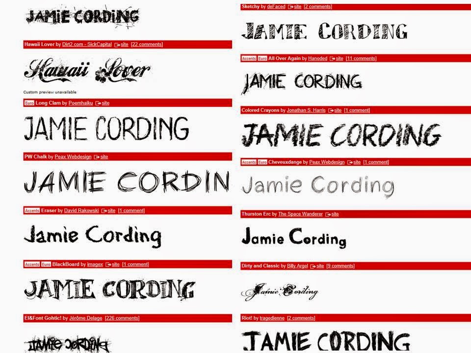
After showing my possible images I could use, I think text is also important for my CD cover/album. I have used a sight called dafont.com to see some possible fonts/texts I could use, im yet to decide to use one from this sight or to go for the simply option and use one on photoshop but I will create a few mock ups/drafts untill I get my final outcome which I am pleased for.
Draft 1 -

Draft 2-

Draft 3-

PhotoShop- Creating draft 3

This first printscreen I have cropped down the original image to take away the negative space. I made sure my photogprah was compatiable with 4 panal digipack.

This second printscreen is where I have change the colour to black and white. I think this works well because it contrasts with the black and white outfits which my charecters are wearing. I have also chnaged the levels which work better and has improved my photograph/cover.

I have now added the name of my song to the front cover. I have chose white because again it fits in with the theme of the front cover. It stands out and it links in with the splashes of white which is also in my front cover.
 The name of my artist I have name 'Jamie Cording' I have chosen to display this in black because it works well with the word 'chocolate.' I am happy with this and I think with the photograph and writing it works well together.
Draft 4-

I have chosen draft 4 for my final front cover for my album, I chose this because I like the pose that my charecter is doing. It creates a nice look and works well with the studio. My music video and poster are quite similar and wanting to not break continuity I thought it would look nice to add something extra and make it abit different. For the rest of my album I have chose images which would suit it best and for my CD's I have decided to leave these in colour because all my products are presented black and white I think it looks nice with a splash of colour and the on the CDs because they link together and I think it works will with the other images that fit in my album. For my back cover I have used simply black and white which works well to show simplicty, I have shown all conventions to a real media product for example the barcode, the producer and the designer aswell as the copyright information. I have also done this on my CD to give it a porfesstional look. Below shows my final album cover for when printed off will work well and show a real and professional product along side my magazine poster/advert.
Final Album Cover

Digi Pack Template
For my digi pak I am using a 6 panal digi pak with 2 CDS, having 2 CD slots so it makes my digi pak up with a CD and a DVD holder. This is used normally is the professional industry standard which would be found in shops for the adverage CD. I have chose this one because it is an easy layout and is ideal for my type of product.
This images below are possible images I could use for my album cover, some are taken while filming but also in the studio I have done a range so I can have some different ones on my album, for example posed but also in natural form: For preactising my digi pak I think that my front cover is the most important image so I have exprimented and created a few mock ups/draft to see which images work better together with the text.
Text Ideas-
After showing my possible images I could use, I think text is also important for my CD cover/album. I have used a sight called dafont.com to see some possible fonts/texts I could use, im yet to decide to use one from this sight or to go for the simply option and use one on photoshop but I will create a few mock ups/drafts untill I get my final outcome which I am pleased for.
Draft 1 -
Draft 2-
Draft 3-
PhotoShop- Creating draft 3
I have shown the process below of how I produced draft 3
This first printscreen I have cropped down the original image to take away the negative space. I made sure my photogprah was compatiable with 4 panal digipack.
This second printscreen is where I have change the colour to black and white. I think this works well because it contrasts with the black and white outfits which my charecters are wearing. I have also chnaged the levels which work better and has improved my photograph/cover.
I have now added the name of my song to the front cover. I have chose white because again it fits in with the theme of the front cover. It stands out and it links in with the splashes of white which is also in my front cover.
Draft 4-
I have chosen draft 4 for my final front cover for my album, I chose this because I like the pose that my charecter is doing. It creates a nice look and works well with the studio. My music video and poster are quite similar and wanting to not break continuity I thought it would look nice to add something extra and make it abit different. For the rest of my album I have chose images which would suit it best and for my CD's I have decided to leave these in colour because all my products are presented black and white I think it looks nice with a splash of colour and the on the CDs because they link together and I think it works will with the other images that fit in my album. For my back cover I have used simply black and white which works well to show simplicty, I have shown all conventions to a real media product for example the barcode, the producer and the designer aswell as the copyright information. I have also done this on my CD to give it a porfesstional look. Below shows my final album cover for when printed off will work well and show a real and professional product along side my magazine poster/advert.
Final Album Cover
Thursday, 19 December 2013
Experimentes/ First Shoot

This First part of my filming I shot in the green room. This photo on the left shows the outfit picked and the styling of my character. In some shots I have picked them to wear a black dress but in this one Elle is wearing a white top and jeans, which still follows the conventions.


My two characters together showing the comparison of them. The positioning of them and creating the right camera angles.


Before shooting I had to prepare my characters to what i wanted them to look like, for example adding make-up and adjusting their hair.

I had Jodee helping me with lighting while I was preparing my characters for filming.
I produced my first shoot in the green room I have taken photos to show the steps and the process of filming the first part of my music video. I have shown the individuals of my characters and what outfits I have chosen for them. I used Jodee to help me with lighting, this shoot was an experiment to see how to create the different shooting methods. This part of filming was mainly to get together some test shots and experiment with the lighting and my two characters together. I am happy with how this part of my filming has gone and I will arrange another opportunity to create better and longer footage.
Monday, 16 December 2013
Ancillary Text Planning
Looking at exsiting album covers I am collecting ideas for my own CD covers I think that the ideas I want to include is the two of my charecters in my video. The album covers only focus on who the band is whereas my CD cover is for the song I have chosen. Below some of the picture ideas I could inspire/ give me ideas for my own.
Possible ideas:
 These 3 photos are taken from Drake and Rihanna's music video which is 'Take Care' This music video insipred me how to create my own CD cover. They're possible ideas which could inspire my own ideas. They show the relationship between the two people. Even though the artists don't follow my genre they're more R&B then indie. I still think it shows a good idea and that the theme of it being shown in black and white follows an aspect of the conventions of indie. They're both wearing casucal clothing with
 Drake wearing a plain black t shirt and Rihanna wearing just a baggy jumper. I like this because it shows the true feelings between them both and you can tell by there body langauge. In each photo they're not looking at eachother which links in with my narrative and shows a slight bit of this. Even though this is just a possible idea it is something which I will base my Ancillary Texts around and I want to express this in my work as it is developed. I will produce test shots of two of my main charecters in this style.

While doing my research and planning I have carried out research for my chosen genre which is indie. This has helped me look at certain album/CD covers which cover this genre. For example different layouts and styles. I am going to look at existing products which suit my genre and which follow the different conventions.

This album cover by The 1975 which is an indie rock band which the song I have chosen for my music video is by this band. This album cover is shown very simple it is following the conventions of its genre by using the theme black and white. It simply states the name of the band which is shown in lights which draws attention towards it. I think this album cover is a very typical one which matches its genre. Its not too flashy or colourful which could easy be related to the genre pop. Without knowing what band it was for you would immediately relate it to indie. When producing my own digi pack and CD cover I will take this into consideration I want it to be draw attention but in a simply way and to know that is it the genre I have shown and it follows all the conventions.

From looking at the album cover which suits my conventions this one I wanted to look at in comparison. It shows how it is all brightly coloured and mainly pink which relates to the name of the album. Compared to the one I just looked at it shows the female artist in the album cover which is Nicki Minaj. It shows the attention more to her and the ways she is presented rather than The 1975 cover which draws more towards the attention of the name of the band rather than the way they look and they have just done it towards the music itself. This has shown the difference between the two different genres and the way the conventions are representation are different and how the colours and the artist is shown.
Possible ideas:


While doing my research and planning I have carried out research for my chosen genre which is indie. This has helped me look at certain album/CD covers which cover this genre. For example different layouts and styles. I am going to look at existing products which suit my genre and which follow the different conventions.

This album cover by The 1975 which is an indie rock band which the song I have chosen for my music video is by this band. This album cover is shown very simple it is following the conventions of its genre by using the theme black and white. It simply states the name of the band which is shown in lights which draws attention towards it. I think this album cover is a very typical one which matches its genre. Its not too flashy or colourful which could easy be related to the genre pop. Without knowing what band it was for you would immediately relate it to indie. When producing my own digi pack and CD cover I will take this into consideration I want it to be draw attention but in a simply way and to know that is it the genre I have shown and it follows all the conventions.

From looking at the album cover which suits my conventions this one I wanted to look at in comparison. It shows how it is all brightly coloured and mainly pink which relates to the name of the album. Compared to the one I just looked at it shows the female artist in the album cover which is Nicki Minaj. It shows the attention more to her and the ways she is presented rather than The 1975 cover which draws more towards the attention of the name of the band rather than the way they look and they have just done it towards the music itself. This has shown the difference between the two different genres and the way the conventions are representation are different and how the colours and the artist is shown.
Monday, 9 December 2013
Filming Schedule
December: 19th
location: Studio
Costumes:
Elle: White baggy top with leather jacket
Jamie: Black skinny jeans and white t shirt
Props: The only props I will need are the different lights I am using, For example soft boxes etc.
In this part of my filming I am shooting the scenes in the studio with this shoot I am going to be experimenting with different lights and different angles to capturing my different shots.These shots will include different tilts of my characters and them both together. Elle and Jamie are my main characters I will have Jodee helping me with lighting and taking photos of me getting my characters ready and recording my process I went through creating my music video.
February: 16th
Costumes:
Jamie: black skinny jeans and white t shirt
props: In this part of my filming I still didn't need any props.
In this part of my filming I did it on the westwood which is a a local woodlands.
location: Studio
Costumes:
Elle: White baggy top with leather jacket
Jamie: Black skinny jeans and white t shirt
Props: The only props I will need are the different lights I am using, For example soft boxes etc.
In this part of my filming I am shooting the scenes in the studio with this shoot I am going to be experimenting with different lights and different angles to capturing my different shots.These shots will include different tilts of my characters and them both together. Elle and Jamie are my main characters I will have Jodee helping me with lighting and taking photos of me getting my characters ready and recording my process I went through creating my music video.
February: 16th
Costumes:
Jamie: black skinny jeans and white t shirt
props: In this part of my filming I still didn't need any props.
In this part of my filming I did it on the westwood which is a a local woodlands.
Subscribe to:
Posts (Atom)