From carrying out research about exsiting magazine adverts for CD albums, I need to create my own for my digi pak. I have a range of photo's I want to use which I took while doing my filming which follow conventions. I will create a few drafts experimenting with different images and text and experiment with what I want include.
Font ideas:


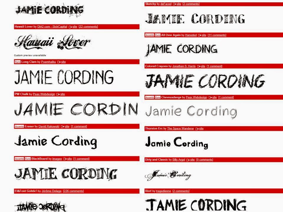
Possible Images:


Some of these images above are not great, but these are what I got of the two charecters together on the day of my filming. Some of them show the great chemistry between the charecters and I will expeirment with some of them to see what work well together.
Mock up 1:

Here shows my first experiment with creating a magazine advert, I have used a font from more the ones I found on defont.com, I like the idea of the font and the capital letters also how it stands out, but I don't like the white boxes around it. I like the photograph and how I have created continuty using black and white. It is still very basic and creating another mock up will help me explore different ideas. I also need to put in a star rating aswell as links to social media.
Mock Up 2:

This mock up I have added more information to my advert for example to star rating from NME and relations to social media, from producing 2 mock ups using the same image and text I now want to see what another image and different text would look like and maybe work better. Im not keen on the white boxes around the text.
Mock Up 3:

I really like this 3rd mock up I have produced, I have changed the image and the text. I have used a font called Mayriad Pro from photograph. This is the same one I used on my CD album by doing this it all links in and I haven't got the white boxes around the text. Even though I am pleased this mock up I want to add to it more, hopefully from spending more time on it I will finally get a finished product and outcome which I am proud of.
Below shows the step by step plan I got by making mock up 3 and then my finished product. From my mock up 3 I started again but using the same things I did previously but adding more and adjusting some things which I think could of made it better.

Here shows my orignal photo that I have taken, I selected the part which I want to crop.

Here shows my cropped image, it focuses on the two people I want it too, I like the expression on my characters face. With my second character looking away it creates a sense of mystery which I like. Kind of an untold story until you have watched my music video to understand.

Here shows the change from colour to black and white, I chose this to create continuity throughout my different products. My products are all presented in black and white, from my music video, CD cover and my magazine advert.

With my characters taking up most of my advert their wasn't much room for any writing to I thought creating this white box and the bottom helped me to present what I wanted to put. The main image won't look to cluttered with writing and also doesn't distract attention away from it.

Adding my writing was important because I had to pick the right font for it, i chose the same font as my CD front cover to create continuity again throughout my products. I think choosing black was a good option because it works well with my image.

Here shows where I have put link to certain social media such as facebook and twitter this is main convention to follow which I have seen from my research. Also adding the I tunes sign shows where you can buy the album from, this shows and promotes my product even more because I tunes is the biggest resource where people get their music from.

Showing a star rating gives it a professional look about it, On my magazine advert my start rating and comment I put from NME. I thought this was a good one to pick because it is a magazine that fits my genre and my advert could possibly be displayed in this advert. So if people from my target audience saw this NME rating it would pull them in even more because this is a magazine they have huge influence from.
Finished Product