Digi Pack Template
For my digi pak I am using a 6 panal digi pak with 2 CDS, having 2 CD slots so it makes my digi pak up with a CD and a DVD holder. This is used normally is the professional industry standard which would be found in shops for the adverage CD. I have chose this one because it is an easy layout and is ideal for my type of product.
This images below are possible images I could use for my album cover, some are taken while filming but also in the studio I have done a range so I can have some different ones on my album, for example posed but also in natural form: For preactising my digi pak I think that my front cover is the most important image so I have exprimented and created a few mock ups/draft to see which images work better together with the text.
Text Ideas-
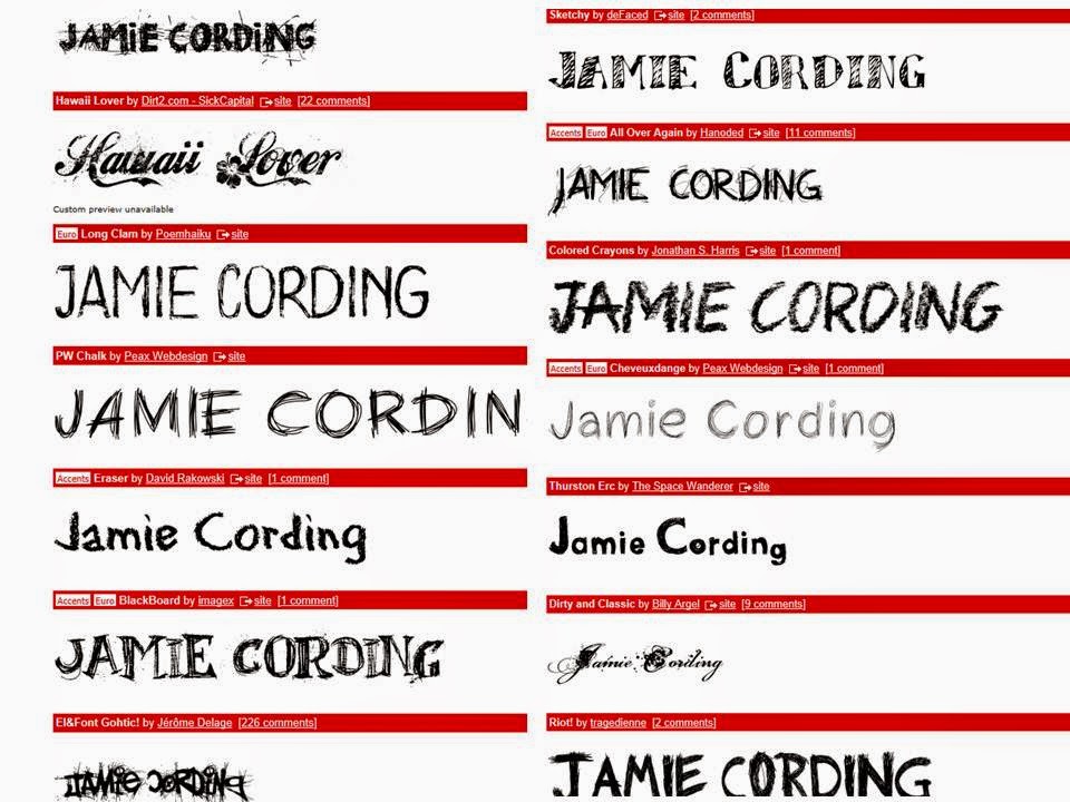
After showing my possible images I could use, I think text is also important for my CD cover/album. I have used a sight called dafont.com to see some possible fonts/texts I could use, im yet to decide to use one from this sight or to go for the simply option and use one on photoshop but I will create a few mock ups/drafts untill I get my final outcome which I am pleased for.
Draft 1 -
Draft 2-
Draft 3-
PhotoShop- Creating draft 3
I have shown the process below of how I produced draft 3
This first printscreen I have cropped down the original image to take away the negative space. I made sure my photogprah was compatiable with 4 panal digipack.
This second printscreen is where I have change the colour to black and white. I think this works well because it contrasts with the black and white outfits which my charecters are wearing. I have also chnaged the levels which work better and has improved my photograph/cover.
I have now added the name of my song to the front cover. I have chose white because again it fits in with the theme of the front cover. It stands out and it links in with the splashes of white which is also in my front cover.
The name of my artist I have name 'Jamie Cording' I have chosen to display this in black because it works well with the word 'chocolate.' I am happy with this and I think with the photograph and writing it works well together.
Draft 4-

I have chosen draft 4 for my final front cover for my album, I chose this because I like the pose that my charecter is doing. It creates a nice look and works well with the studio. My music video and poster are quite similar and wanting to not break continuity I thought it would look nice to add something extra and make it abit different. For the rest of my album I have chose images which would suit it best and for my CD's I have decided to leave these in colour because all my products are presented black and white I think it looks nice with a splash of colour and the on the CDs because they link together and I think it works will with the other images that fit in my album. For my back cover I have used simply black and white which works well to show simplicty, I have shown all conventions to a real media product for example the barcode, the producer and the designer aswell as the copyright information. I have also done this on my CD to give it a porfesstional look. Below shows my final album cover for when printed off will work well and show a real and professional product along side my magazine poster/advert.
Final Album Cover


No comments:
Post a Comment